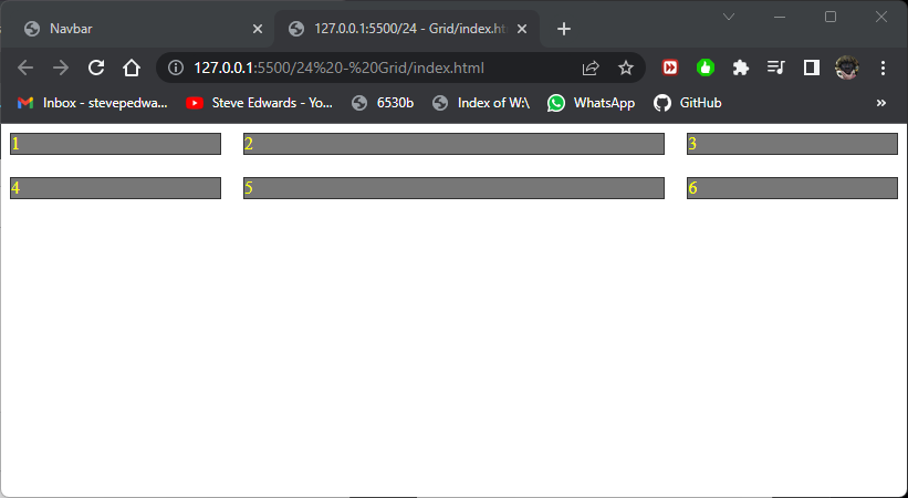
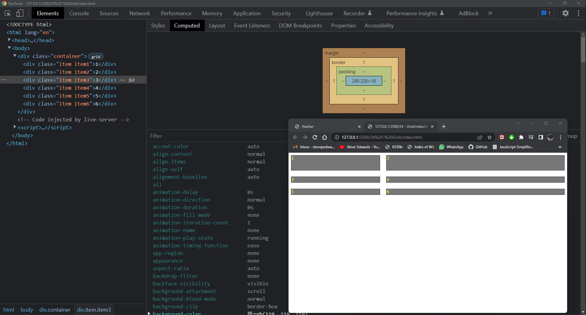
Grid is similar to Flex in that you tell it what layout style you want, but in form of columns and rows. In this case there are 3 columns with column 2 twice the width of 1 and 3:
<!DOCTYPE html>
<html lang="en">
<head>
    <style>
        .item {
            border: 1px solid #333;
            background-color: #777;
            color: yellow;
        }

        /* you modify a container for the grid model layout, similarly as you would for flex then it acts on all the children. Default IS 2D top to
        bottom layout anyway, so stacked items don't change initially, so appears to do nothing here until you tell it which columns exist and what
        size to be with grid-template-columns, then it affects the children in that container*/
        .container {
            display: grid;
            /* only 2 columns are defined here, so div2 wraps up to div1 line. div3 stays in column 1 same size as div1  */
            /* grid-template-columns: 100px 50px;
            grid-template-rows: 50px 100px; */
            /* if above is commented out, you can do same defining rows and columns at same time. Not so clear what happens */
            /* grid-template: 50px 100px / 100px 100px  */
            /* auto rows defines a default for undefined rows - same as auto and same for columns */
            /* grid-auto-rows: auto; */
            /* grid-template-rows: 50px;
            grid-auto-rows: 150px; */
            /* another format is fractional: the width divides up 3 columns below, into quarters of total width with middle column at 1/2 width, start and end columns of 1/4 width*/
            grid-template-columns: 1fr 2fr 1fr;
            /* row-gap: 20px;
            column-gap: 20px; */
            /* the 2 above lines can be done by */
            gap: 20px;
        }

        .item1 {

        }

        .item2 {

        }

        .item3 {

        }
    </style>
</head>
<body>
    <div class="container">
        <div class="item item1">1</div>
        <div class="item item2">2</div>
        <div class="item item3">3</div>
        <div class="item item4">4</div>
        <div class="item item5">5</div>
        <div class="item item6">6</div>
    </div>

</body>
</html>
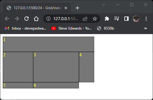
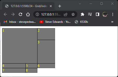
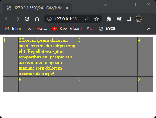
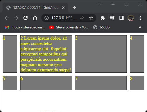
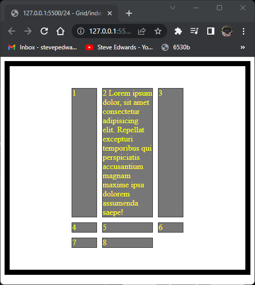
The inline block divs, 1-6, that want to take up a whole column to themselves auto fit the grid template format up to the available view width and auto size with browser resize:
grid-template-columns: 1fr 2fr 1fr;
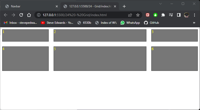
The row height can also be set similarly. Row 2 is twice the height of row 1:
.container {
            display: grid;
            /* only 2 columns are defined here, so div2 wraps up to div1 line. div3 stays in column 1 same size as div1  */
            /* grid-template-columns: 100px 50px;
            grid-template-rows: 50px 100px; */
            /* if above is commented out, you can do same defining rows and columns at same time. Not so clear what happens */
            /* grid-template: 50px 100px / 100px 100px  */
            /* auto rows defines a default for undefined rows - same as auto and same for columns */
            /* grid-auto-rows: auto; */
            /* grid-template-rows: 50px;
            grid-auto-rows: 150px; */
            /* another format is fractional: the width divides up 3 columns below, into quarters of total width with middle column at 1/2 width, start and end columns of 1/4 width*/
            grid-template-columns: 1fr 2fr 1fr;
            grid-template-rows: 50px 100px;
            /* row-gap: 20px;
            column-gap: 20px; */
            /* the 2 above lines can be done by */
            gap: 20px;
        }
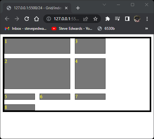
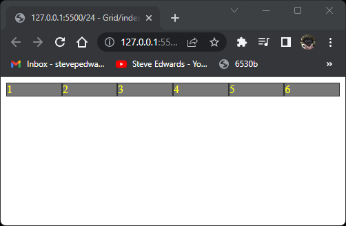
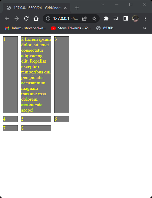
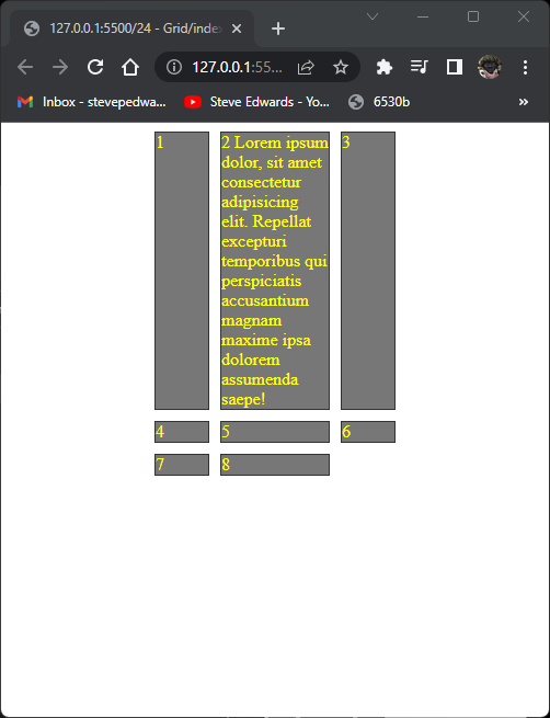
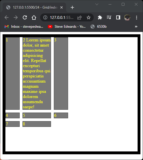
For any undefined rows or columns added to the HTML, the default is same as:
/* auto rows defines a default for undefined rows - same as auto and same for columns */ /*
grid-template-columns: 1fr 2fr;
grid-template-rows: 50px;
The undefined rows default to the min div height for their row:
Notice that the extra undefined rows of divs 5+6 are also the same height as row 2 because only the first row is defined at 50px so all those after cycle back round to a default value of 18px shown in DevTools F12:
Grid auto flow is similar to Flex direction in changing the axes by which the elements fill the page space - by row or column:
.container {
            display: grid;
            grid-auto-flow: column;
        }
.container {
            display: grid;
            grid-auto-flow: row;
        }
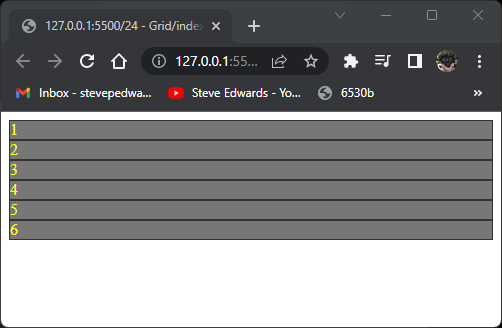
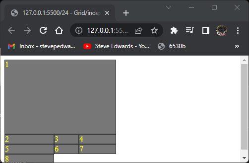
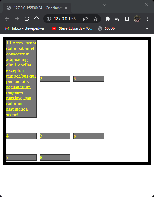
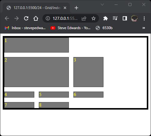
You can pre-define grid areas by name then fit a particular div item to that area:
.container {
            display: grid;
            grid-template-columns: 100px 250px;
            grid-template-rows: 50px 100px;
            grid-template-areas:
            "header header"
            "sidebar content";
        }

        .item1 {
            grid-area: header;
        }

        .item2 {
            grid-area: sidebar;
        }

        .item3 {
            grid-area: content;
        }
item 1 fills the space named header, so takes two columns.
item 2 fills the sidebar area, item 3 the content area:
Again the overflow divs default to the values for the defined two columns widths:
grid-template-columns: 100px 250px;
but with default heights of 18px for elements 4, 5,and 6. You see the similarity of this aspect of Grid to Flex here.
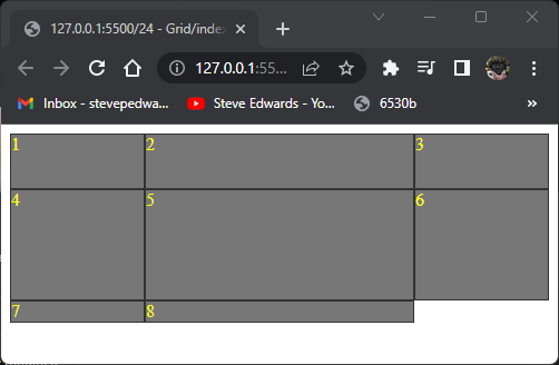
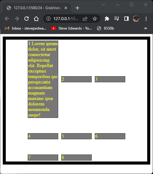
A period can be used to denote "anything" to filler to an undecided category:
.container {
            display: grid;
            grid-template-columns: 100px 150px 50px;
            grid-template-rows: 50px 100px;
            grid-template-areas:
            "header header header"
            "sidebar content .";
        }

        .item1 {
            grid-area: header;
        }

        .item2 {
            grid-area: sidebar;
        }

        .item3 {
            grid-area: content;
        }
Div 4 fills the . area of :
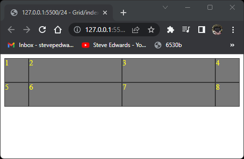
.container {
            display: grid;
            grid-template-columns: 100px 50px 75px;
            grid-template-rows: 50px 100px;
        }

        .item1 {
        }

        .item2 {
        }

        .item3 {
        }
So, row 1 is 50px high, row 2 is 100px high.
Column 1 is 100px wide, column 2 is 50px wide, column 3 is 75px wide:
So, to have item1 span 2 columns, you count the cell walls from left, so will start at 1 and end at 3:
.item1 {
            grid-column-start: 1;
            grid-column-end: 3;
        }
This shows item 1 spanning 2 columns:
The same result from:
.item1 {
            grid-column-start: 1 / 3
        }
The same format applies to rows top to bottom:
.item1 {
            grid-column-start: 1;
            grid-column-end: 3;
            grid-row-start: 1;
            grid-row-end: 3;
        }
This causes item 1 to start at page top cell border and end at row 3 border:

.item1 {
grid-column-start: 1 / 3
grid-row-start: 1 / 3
}
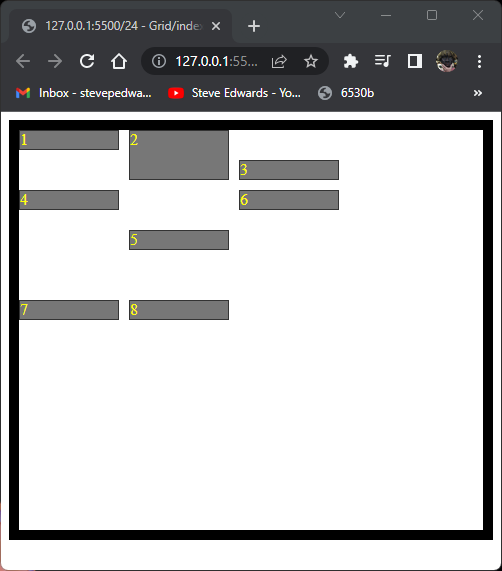
You can place any item in any row:
.item1 {
            grid-column-start: 1 / 3;
            grid-row: 2 ;
        }

.item1 {
            grid-column-start: 1 / 3;
            grid-row: span 2;
        }
Same for columns:
.item1 {
grid-column-start: span 2;
grid-row: span 2;
}
A way to make item 1 fill 2 rows AND columns is confusing at first:
.item1 {
            grid-column: 1 / -1 ;
            grid-row: 1 / -1 ;
        }
This works because the -1 row is at the START of the only 2nd row defined in the initial container:
.container {
            display: grid;
            grid-template-columns: 100px 50px 75px;
            grid-template-rows: 50px 100px;
        }
So the bottom edge of row 2 (100px row)= -1 of those defined so countable. The rest are overflow at row height defaults.
A powerful method similar to flex-grow uses fractional ratios for column widths:
.container {
            display: grid;
            grid-template-columns: 1fr 2fr 1fr;
            grid-template-rows: 50px 100px;
        }

        .item1 {

        }

        .item2 {
        }

        .item3 {
        }
The centre column is twice the width of cols 1 and 3 as the whole page width is divided into 4 equal widths then shared by the defined proportions 1fr 2fr 1fr;
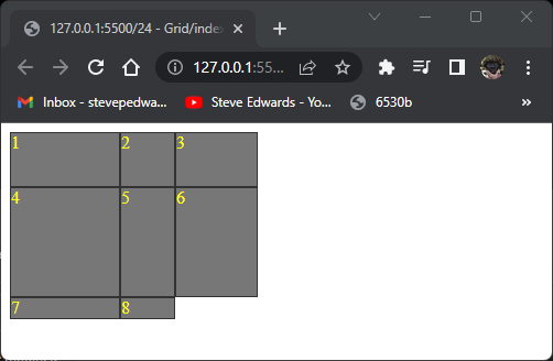
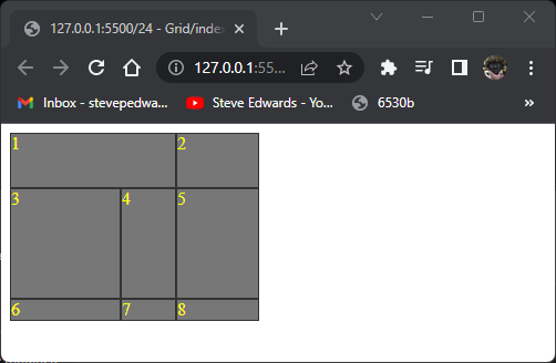
Other self explanatory formats like:
.container {
            display: grid;
            grid-template-columns: 50px repeat(2, 1fr) 50px;
            grid-template-rows: 50px 50px;
        }
gives a grid of:
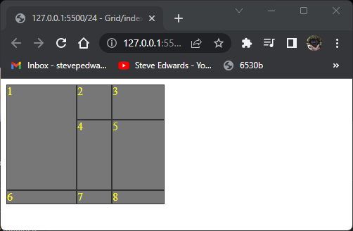
For these cells to be used for actual content, a min height can be specified, and so that larger text amounts will be accomodated automatically from the above layout to a view that expands according to the text:
.container {
            display: grid;
            grid-template-columns: 50px repeat(2, 1fr) 50px;
            grid-template-rows: minmax(50px, auto) 50px;
        }
A property that grid has that flex does not, is row-gap and column-gap for spacing between cells:
.container {
            display: grid;
            grid-template-columns: 50px repeat(2, 1fr) 50px;
            grid-template-rows: minmax(50px, auto) 50px;
            row-gap: 10px;
            column-gap: 10px;
        }
That can be shortened for same result for rows AND columns to just gap:
display: grid;
            grid-template-columns: 50px repeat(2, 1fr) 50px;
            grid-template-rows: minmax(50px, auto) 50px;
            /* row-gap: 10px;
            column-gap: 10px; */
            gap: 10px;
        }
It's possible to align the total grid content to top left, within it's parent container with justify-content :
.container {
            display: grid;
            grid-template-columns: 50px 100px 50px;
            /* grid-template-rows: .5fr .5fr .5fr; */
            /* row-gap: 10px;
            column-gap: 10px; */
            gap: 10px;
            justify-content: start;
        }
.container {
            display: grid;
            grid-template-columns: 50px 100px 50px;
            /* grid-template-rows: .5fr .5fr .5fr; */
            /* row-gap: 10px;
            column-gap: 10px; */
            gap: 10px;
            justify-content: center;
            height: 400px;
            border: 10px solid black;
            align-content: center;
        }
.container {
            display: grid;
            grid-template-columns: 50px 100px 50px;
            /* grid-template-rows: .5fr .5fr .5fr; */
            /* row-gap: 10px;
            column-gap: 10px; */
            gap: 10px;
            justify-content: stretch;
            height: 400px;
            border: 10px solid black;
            align-content: stretch;
        }
.container {
            display: grid;
            grid-template-columns: repeat(3, 100px);
            grid-template-rows: minmax(50px, auto) 100px;
            gap: 10px;
            height: 400px;
            border: 10px solid black;
            align-content: start;
            justify-content: start;
            align-items: center;
        }

        .item1 {
        }
Everything centered:
.container {
            display: grid;
            grid-template-columns: repeat(3, 100px);
            grid-template-rows: minmax(50px, auto) 100px;
            gap: 10px;
            height: 400px;
            border: 10px solid black;
            align-content: center;
            justify-content: center;
            align-items: center;
        }
Individual cells can be aligned with align:self:
<style>
        .item {
            border: 1px solid #333;
            background-color: #777;
            color: yellow;
        }

        /* you modify a container for the grid model layout, similarly as you would for flex then it acts on all the children. Default IS 2D top to
        bottom layout anyway, so stacked items don't change initially, so appears to do nothing here until you tell it which columns exist and what
        size to be with grid-template-columns, then it affects the children in that container*/
        .container {
            display: grid;
            grid-template-columns: repeat(3, 100px);
            grid-template-rows: minmax(50px, auto) 100px;
            gap: 10px;
            height: 400px;
            border: 10px solid black;
            align-content: flex-start;
            justify-content: start;
            align-items: flex-start;
        }

        .item1 {
            align-self: flex-start;
        }

        .item2 {
            align-self: stretch;
        }

        .item3 {
            align-self: flex-end;
        }

        .item4 {
            align-self: flex-start;
        }
        .item5 {
            align-self: center;
        }
    </style>
Gaps can be filled in if a cell can fit in a space using:
grid-auto-flow: dense;
but the HTML flow order will be out of order. Going from 1,2,3 to 1,3,2:
.container {
            display: grid;
            grid-auto-flow: row;
            grid-template-columns: repeat(3, 100px);
            grid-template-rows: minmax(50px, auto) 100px;
            gap: 15px;
            border: 5px solid black;

        }

        .item1 {
            grid-column: span 2;
        }

        .item2 {
            grid-column: span 2;
        }
If dense is used, item 3 will be flowed to take up the space next to item 1:
.container {
            display: grid;
            grid-auto-flow: dense;
            grid-template-columns: repeat(3, 100px);
            grid-template-rows: minmax(50px, auto) 100px;
            gap: 15px;
            border: 5px solid black;

        }