Because flex is such a powerful and common selector, I've summarised most of it's useful aspects, in a short enough document, so even Joe might read it..(lots of pics, min text) lol!
<!DOCTYPE html>
<html lang="en">
<head>
<meta charset="UTF-8">
<meta http-equiv="X-UA-Compatible" content="IE=edge">
<meta name="viewport" content="width=device-width, initial-scale=1.0">
<title>Document</title>
<link rel="stylesheet" href="styles.css">
<style>
.item {
border: 1px solid black;
background-color: #777;
width: 75px;
color: yellow;
margin: 10px;
}
/* Using display: block, element behaviour inside it's parent is changed. Flex changes how all the children - 1 LEVEL below only (not grandchildren)! - behave inside their main container*/
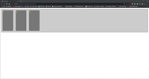
.container {
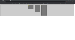
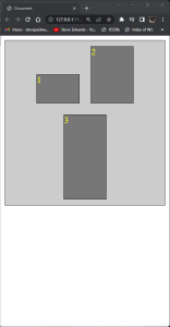
/* margins DO NOT collapse in Flex! It 1D in the sense the doc flow is either L-R(X axis) or T-B(Y axis) so next to, or stacked. Default is justify-content: flex-start;*/
/* flex-end, center, space-between, space-around */
display: flex;
background-color: #CCC;
border: 1px solid;
justify-content: space-evenly;
}
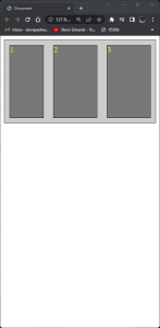
.item1 {
height: 50px;
}
.item2 {
height: 100px;
}
.item3 {
height: 150px;
}
</style>
</head>
<body>
<!-- div s are display block elements so can't have anything next to them so stack on top -->
<div class="container">
<div class="item item1">1</div>
<div class="item item2">2</div>
<div class="item item3">3</div>
</div>
</body>
</html>
.container {
            /* margins DO NOT collapse in Flex! It 1D in the sense the doc flow is either L-R(X axis) or T-B(Y axis)  so next to, or stacked. Default is justify-content: flex-start;*/
            /* flex-end, center, space-between, space-around */
            /* display: flex;
            background-color: #CCC;
            border: 1px solid;

        }
 display: flex;
justify-content: space-between;
justify-content: space-around;
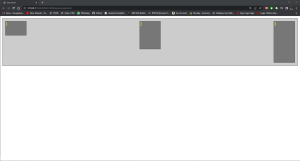
For X axis positioning:
.container {
            /* margins DO NOT collapse in Flex! It 1D in the sense the doc flow is either L-R(X axis) or T-B(Y axis)  so next to, or stacked. Default is justify-content: flex-start;*/
            /* flex-end, center, space-between, space-around */
            display: flex;
            background-color: #CCC;
            border: 1px solid;
            /* For X axis align default is stretch so elements stay symmetrical with browser size - up to a limit */
            align-items: stretch;
        }
Default is:
align-items: stretch;
<!DOCTYPE html>
<html lang="en">
<head>
<meta charset="UTF-8">
<meta http-equiv="X-UA-Compatible" content="IE=edge">
<meta name="viewport" content="width=device-width, initial-scale=1.0">
<title>Document</title>
<link rel="stylesheet" href="styles.css">
<style>
.item {
border: 1px solid black;
background-color: #777;
width: 75px;
color: yellow;
margin: 10px;
}
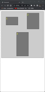
/* Using display: block, element behaviour inside it's parent is changed. Flex changes how all the children - 1 LEVEL below only (not grandchildren)! - behave inside their main container*/
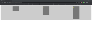
.container {
/* margins DO NOT collapse in Flex! It 1D in the sense the doc flow is either L-R(X axis) or T-B(Y axis) so next to, or stacked. Default is justify-content: flex-start;*/
/* flex-end, center, space-between, space-around */
display: flex;
background-color: #CCC;
border: 1px solid;
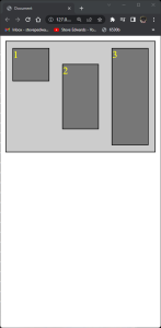
/* For X axis align default is stretch so if elements are set to a min-height, they all grow to same height as tallest element*/
align-items: stretch;
}
.item1 {
min-height: 50px;
}
.item2 {
min-height: 100px;
}
.item3 {
min-height: 150px;
}
</style>
</head>
<body>
<!-- divs are display block elements so can't have anything next to them so stack on top -->
<div class="container">
<div class="item item1">1</div>
<div class="item item2">2</div>
<div class="item item3">3</div>
</div>
</body>
</html>
align-items: stretch;
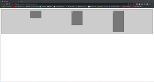
If,
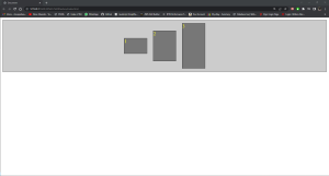
.container {
            /* margins DO NOT collapse in Flex! It 1D in the sense the doc flow is either L-R(X axis) or T-B(Y axis)  so next to, or stacked. Default is justify-content: flex-start;*/
            /* flex-end, center, space-between, space-around */
            display: flex;
            background-color: #CCC;
            border: 1px solid;
            /* for X axis */
            justify-content: space-around;
            /* for Y axis */
            align-content: space-around;
            align-items: center;
            flex-wrap: wrap;
        }
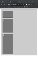
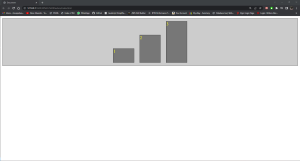
For the same effects on the Y axis, we can change that to be the main axis with, flex-direction: column;
.container {
            /* margins DO NOT collapse in Flex! It 1D in the sense the doc flow is either L-R(X axis) or T-B(Y axis)  so next to, or stacked. Default is justify-content: flex-start;*/
            /* flex-end, center, space-between, space-around */
            display: flex;
            background-color: #CCC;
            border: 1px solid;
            flex-direction: column;
        }
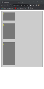
.item3  {
            min-height: 150px;
            flex-grow: 1;
        }
.item {
            border: 1px solid black;
            background-color: #777;
            width: 75px;
            color: yellow;
            margin: 10px;
        }
So the remaining space is shared between items 2 and 3 in a 2:1 ratio
<style>
        .item {
            border: 1px solid black;
            background-color: #777;
            width: 100px;
            color: yellow;
            margin: 10px;
        }

        /* Using display: block, element behaviour inside it's parent is changed. Flex changes how all the children - 1 LEVEL below only (not grandchildren)! - behave inside their main container*/
        .container {
            /* margins DO NOT collapse in Flex! It 1D in the sense the doc flow is either L-R(X axis) or T-B(Y axis)  so next to, or stacked. Default is justify-content: flex-start;*/
            /* flex-end, center, space-between, space-around */
            display: flex;
            background-color: #CCC;
            border: 1px solid;
            /* for X axis
            justify-content: space-around;
            /* for Y axis */
            /* align-content: space-around;
            align-items: center;
            flex-wrap: wrap; */
            /* flex-direction: row;*/
        }

        .item1  {
            min-height: 50px;
            flex-shrink: 0;
        }

        .item2  {
            min-height: 100px;
            /* flex-shrink: 1; */
        }

        .item3  {
            min-height: 150px;
            /* flex-shrink: 1; */
        }

    </style>
flex-shrink: 0;
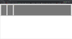
So, the item with a flex shrink of 3 shrinks 3 times faster than the item with a shrink of 1, down to min browser width. In my Chrome browser, the zoom has to be at 150% to see this effect at these 100px widths:
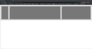
The align-self selector allows each div to be aligned within the parent container:
.item1  {
            align-self: flex-start;
            min-height: 50px;
            /* flex-shrink: 3; */
        }

        .item2  {
            align-self: center;
            min-height: 100px;
            /* flex-shrink: 1; */
        }

        .item3  {
            min-height: 150px;
            /* flex-shrink: 1; */
        }
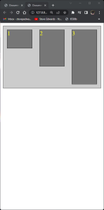
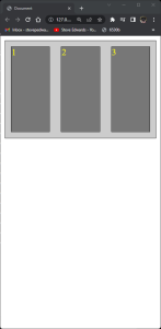
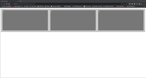
The order of the items document flow can also be changed with order: x selector:
.item1  {
            align-self: flex-start;
            min-height: 50px;
            order: 2;
            /* flex-shrink: 3; */
        }

        .item2  {
            order: 3;
            align-self: center;
            min-height: 100px;
            /* flex-shrink: 1; */
        }

        .item3  {
            order: 1;
            min-height: 150px;
            /* flex-shrink: 1; */
        }
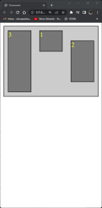
Ordering starts at 0, so an item without an order number will be first in the flow. Negative numbers apply too. It's not recommended to use order as it alters the order of tabbed items and screen read elements as it doesn't change the HTML element order, obviously.
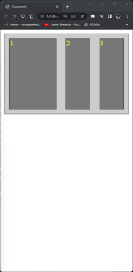
Finally, the flex container can be changed to act like an inline block too with display: inline-flex;
<head>
<meta charset="UTF-8">
<meta http-equiv="X-UA-Compatible" content="IE=edge">
<meta name="viewport" content="width=device-width, initial-scale=1.0">
<title>Document</title>
<link rel="stylesheet" href="styles.css">
<style>
.item {
border: 1px solid black;
background-color: #777;
width: 75px;
color: yellow;
margin: 10px;
}
/* Using display: block, element behaviour inside it's parent is changed. Flex changes how all the children - 1 LEVEL below only (not grandchildren)! - behave inside their main container*/
.container {
/* margins DO NOT collapse in Flex! It 1D in the sense the doc flow is either L-R(X axis) or T-B(Y axis) so next to, or stacked. Default is justify-content: flex-start;*/
/* flex-end, center, space-between, space-around */
display: inline-flex;
background-color: #CCC;
border: 1px solid;
/* for X axis
justify-content: space-around;
/* for Y axis */
/* align-content: space-around;
align-items: center;
flex-wrap: wrap; */
/* flex-direction: row;*/
}
.item1 {
align-self: flex-start;
min-height: 50px;
order: 2;
/* flex-shrink: 3; */
}
.item2 {
order: 3;
align-self: center;
min-height: 100px;
/* flex-shrink: 1; */
}
.item3 {
order: 1;
min-height: 150px;
/* flex-shrink: 1; */
}
</style>
</head>
<body>
<!-- divs are display block elements so can't have anything next to them so stack on top -->
<div class="container">
<div class="item item1">1</div>
<div class="item item2">2</div>
<div class="item item3">3</div>
</div>
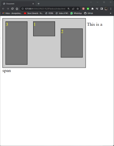
<span>This is a span</span>
</body>